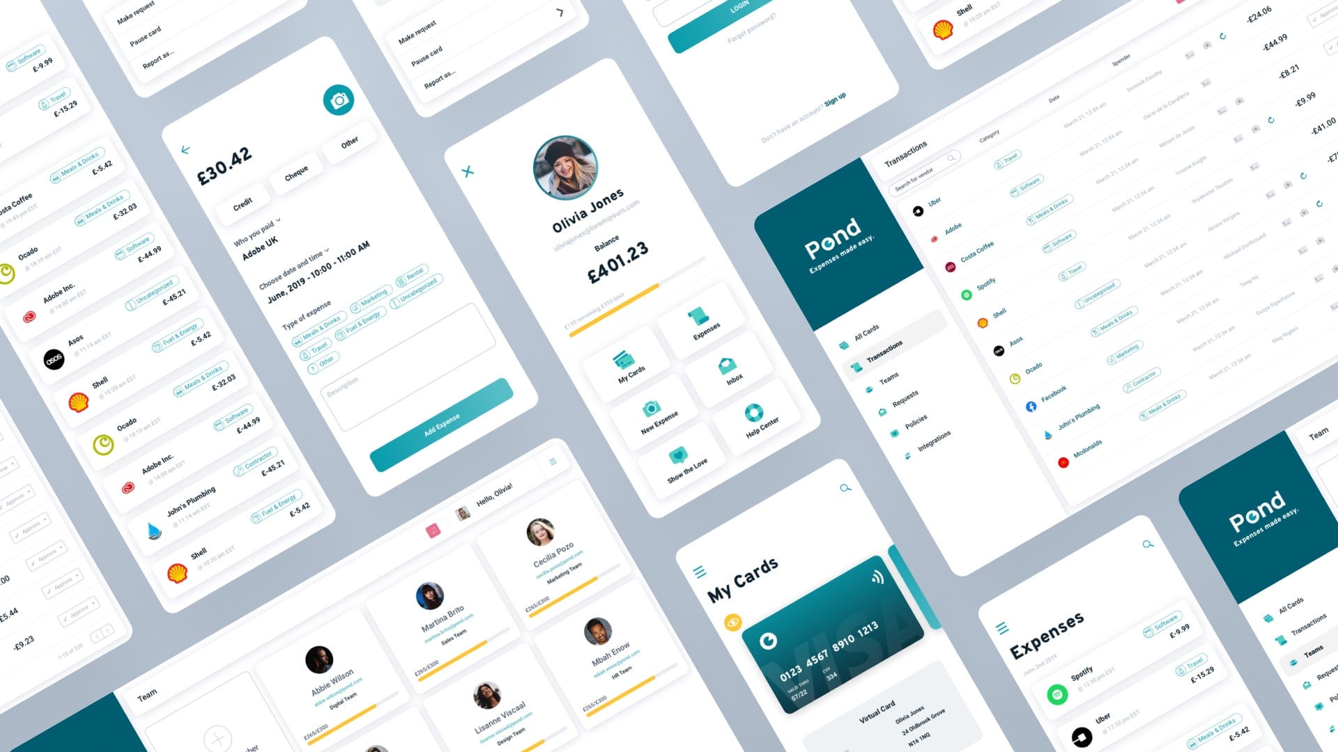
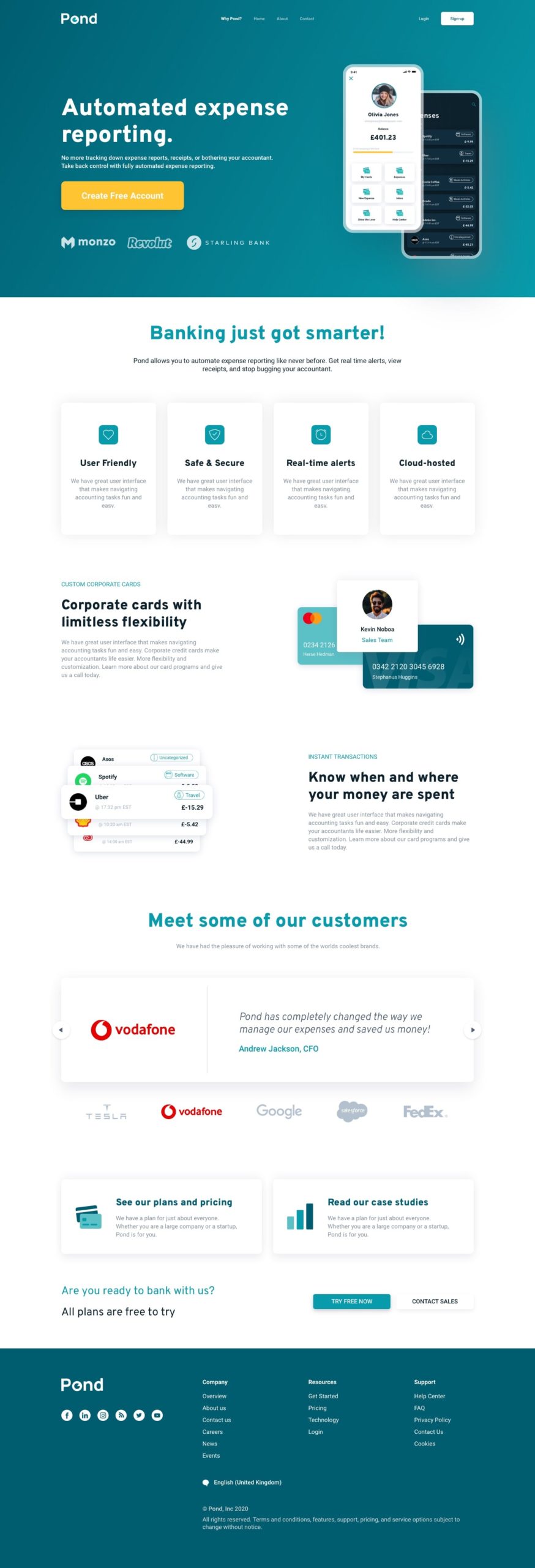
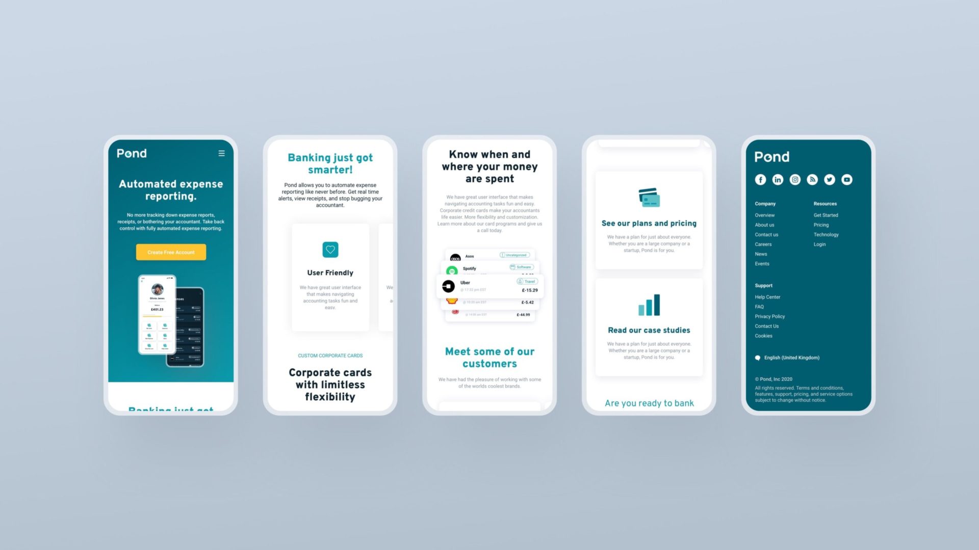
The App
From the customer journey that I received, I designed the wireframes, the high-fidelity designs and a prototype and did run users testing, which has helped us create the MVP.
I designed a comprehensive design system with strict atomic principles to allow the rapid creation of pages with reusable components. I labelled each screen with detailed UX instruction to streamline the handover to frontend.
The problems that we had to tackle:
- Paper Receipts
- No spending limits
- No transaction limits
- No real-time monitoring
- Lack of analytics
- Trust requirements to issue company card
- No monthly subscription insight
- No department spending breakdown
- Virtual payments
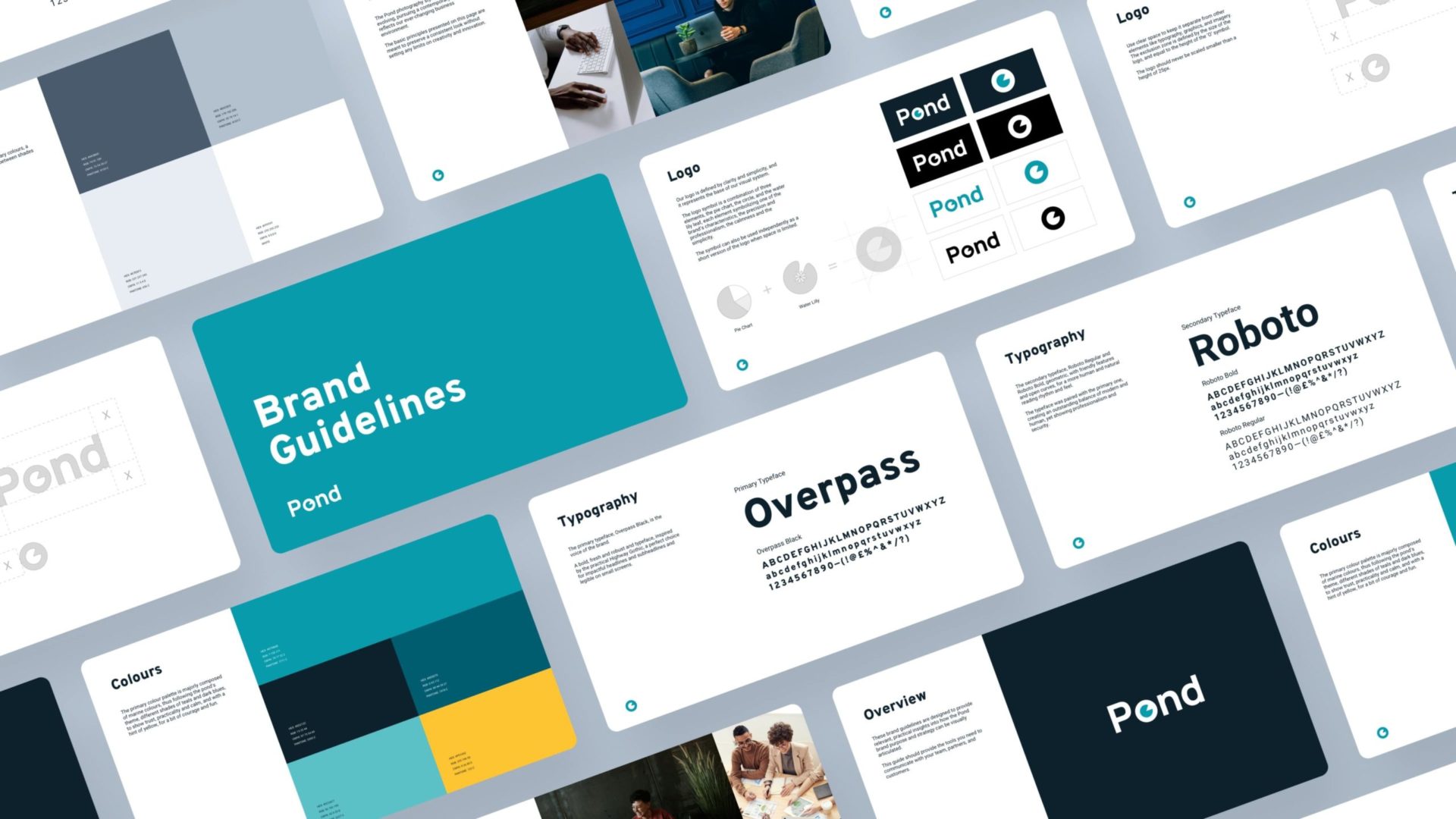
Name
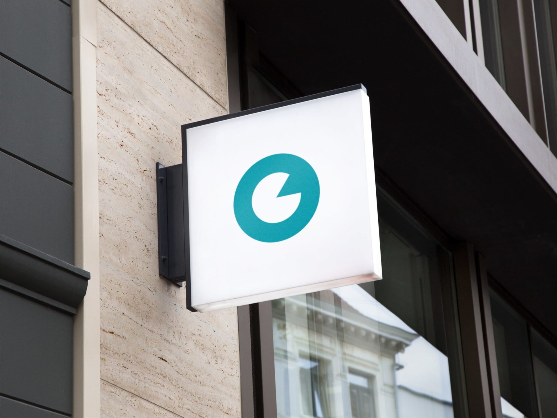
The client came with the name, Pond, which was also the primary source of influence in designing the logo and choosing the colour palette. I’ve combined three symbols: the pie chart representing the financial sector, the circle, and the water lily leaf for calm, resulting in a clean, stable and geometric logo.
Colours
The primary colour palette is majorly composed of marine colours, thus following the pond’s theme, different shades of teals and dark blues, to show trust, practicality and calm, and with a hint of yellow, for a bit of courage and fun.
They are supported by secondary colours – a range of greys and blacks. These neutral, in-between shades add extra depth to the designs.
Typography
The primary typeface, Overpass Black, is the voice of the brand. A bold, fresh and robust and typeface, inspired by the practical Highway Gothic, a perfect choice for impactful headlines and subheadlines and legible on small screens.
The secondary typeface, Roboto Regular and Roboto Bold, geometric, with friendly features and open curves, for a more human and natural reading rhythm and feel. The typeface was paired with the primary one, creating an outstanding balance of modern and human, yet showing professionalism and security.
Dark Mode
In order for the design to meet the 2020 standards and trends, I’ve designed the Dark UI mode as well. This mode reduces the luminance emitted by device screens while still meeting minimum colour contrast ratios. It helps improve visual ergonomics by reducing eye strain, adjusting brightness to current lighting conditions, and facilitating screen use in dark environments – all while conserving battery power.